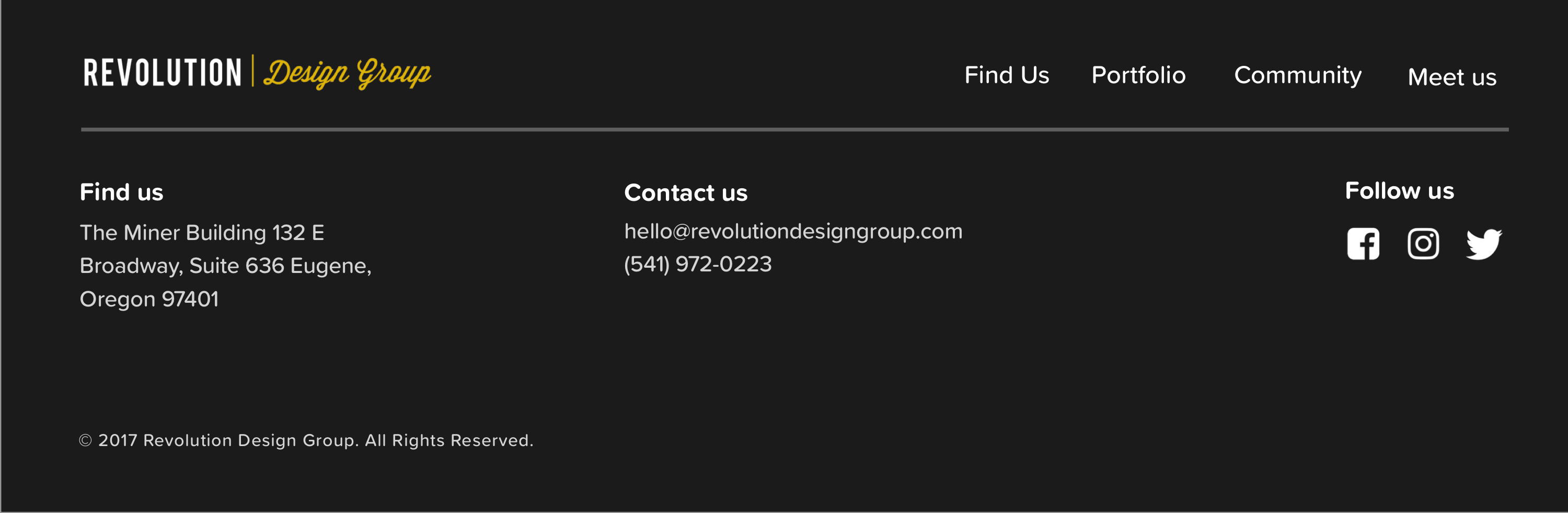
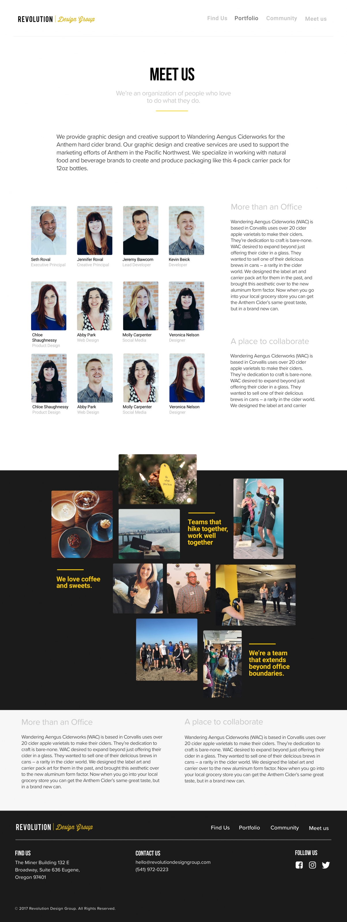
Revolution Design Group
The leading print/package design, web design, and social media firm in Eugene, Revolution Design Group does it all for brands like Yogi Tea, Ninkasi Brewing, and Coconut Bliss. An opportunity to intern for Revolution Design Group thanks to LaneESD soon turned into a job opportunity after creating a concept redesign of their website and brand book.
Client work involved Lane County Fair, Curandi, and Mid Valley Metals.
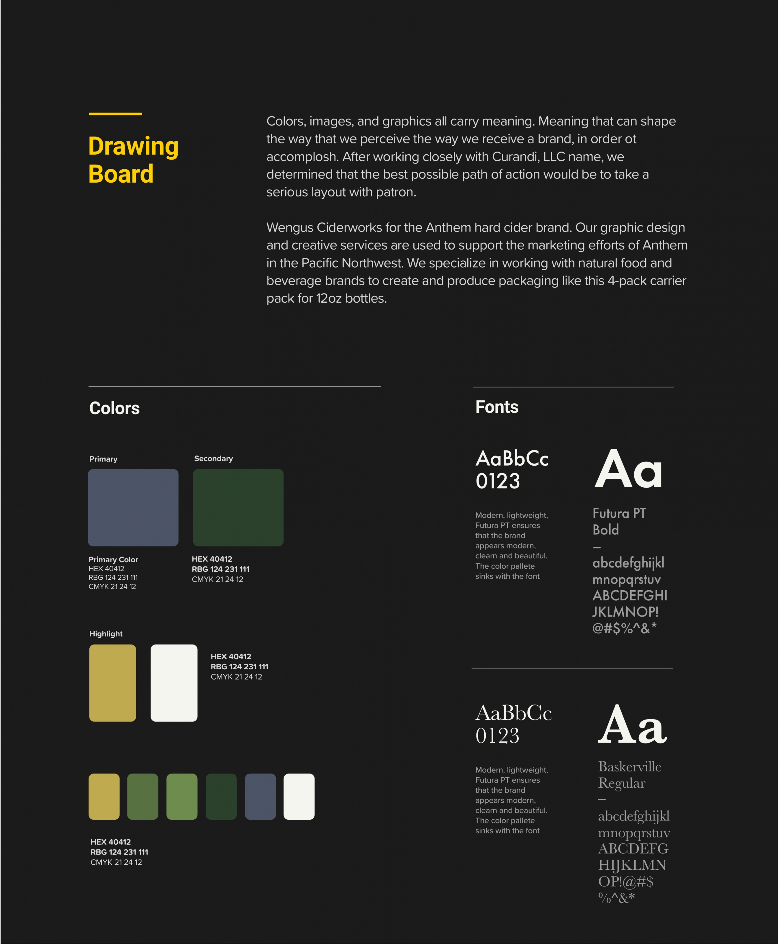
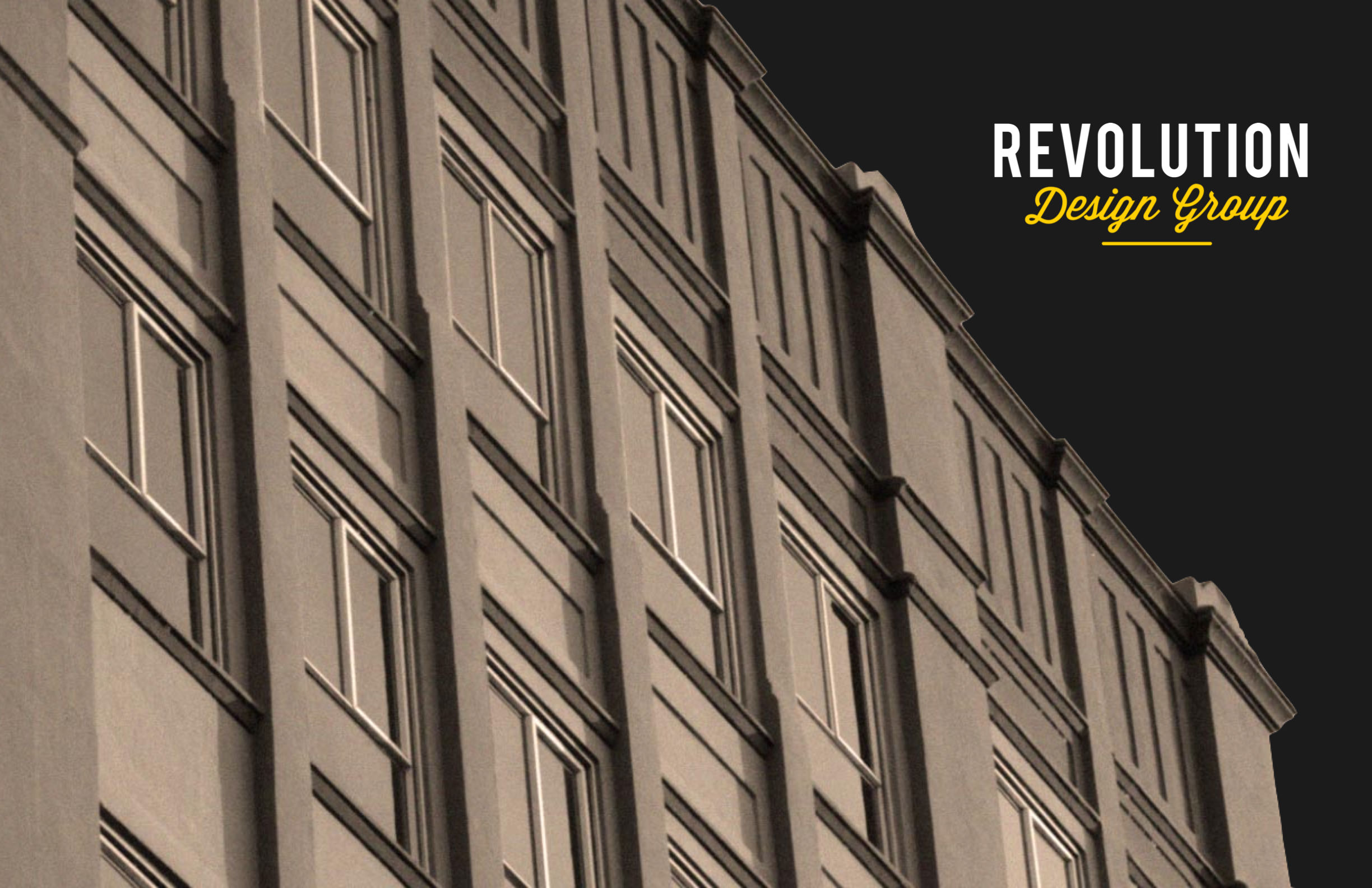
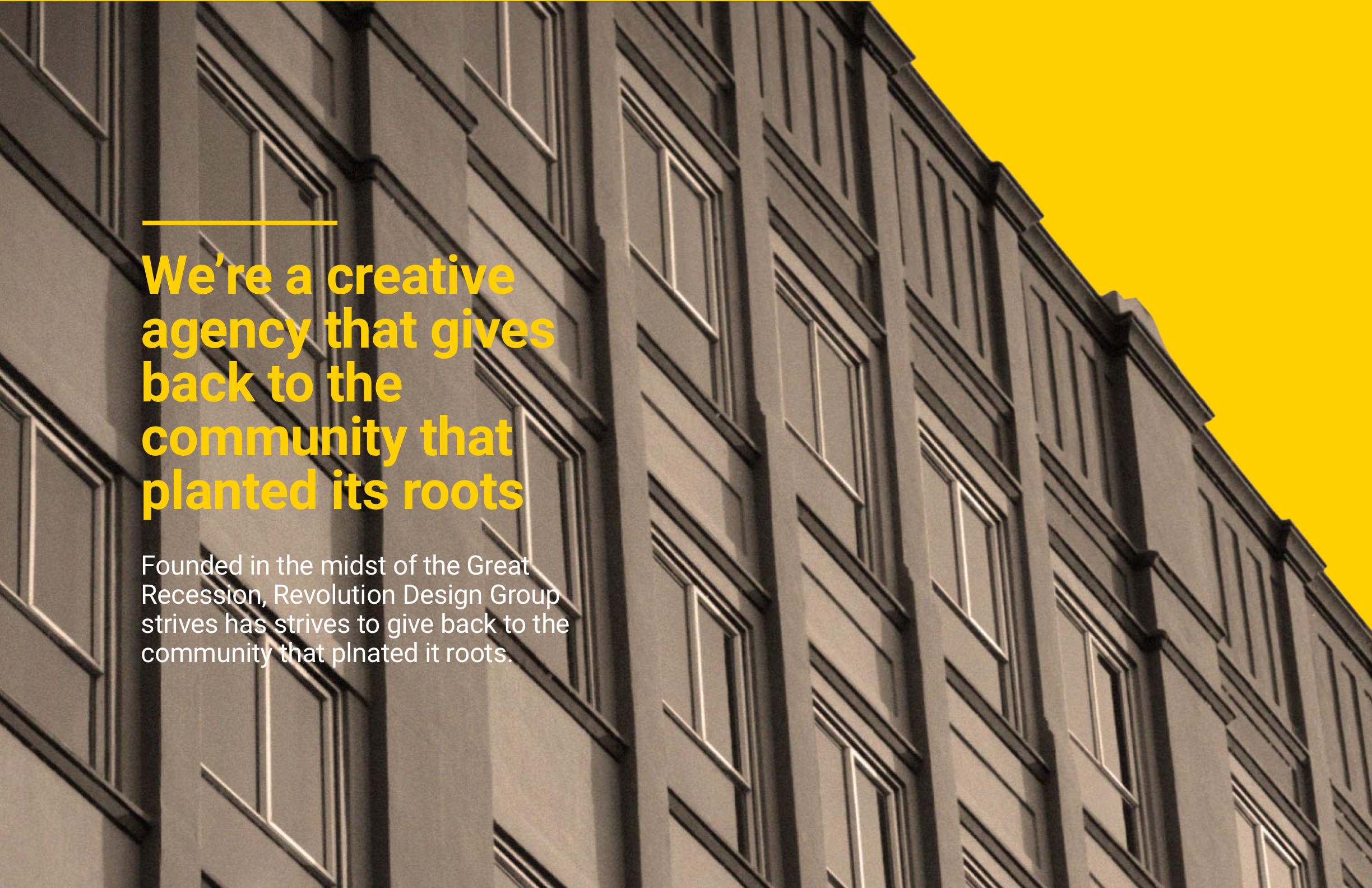
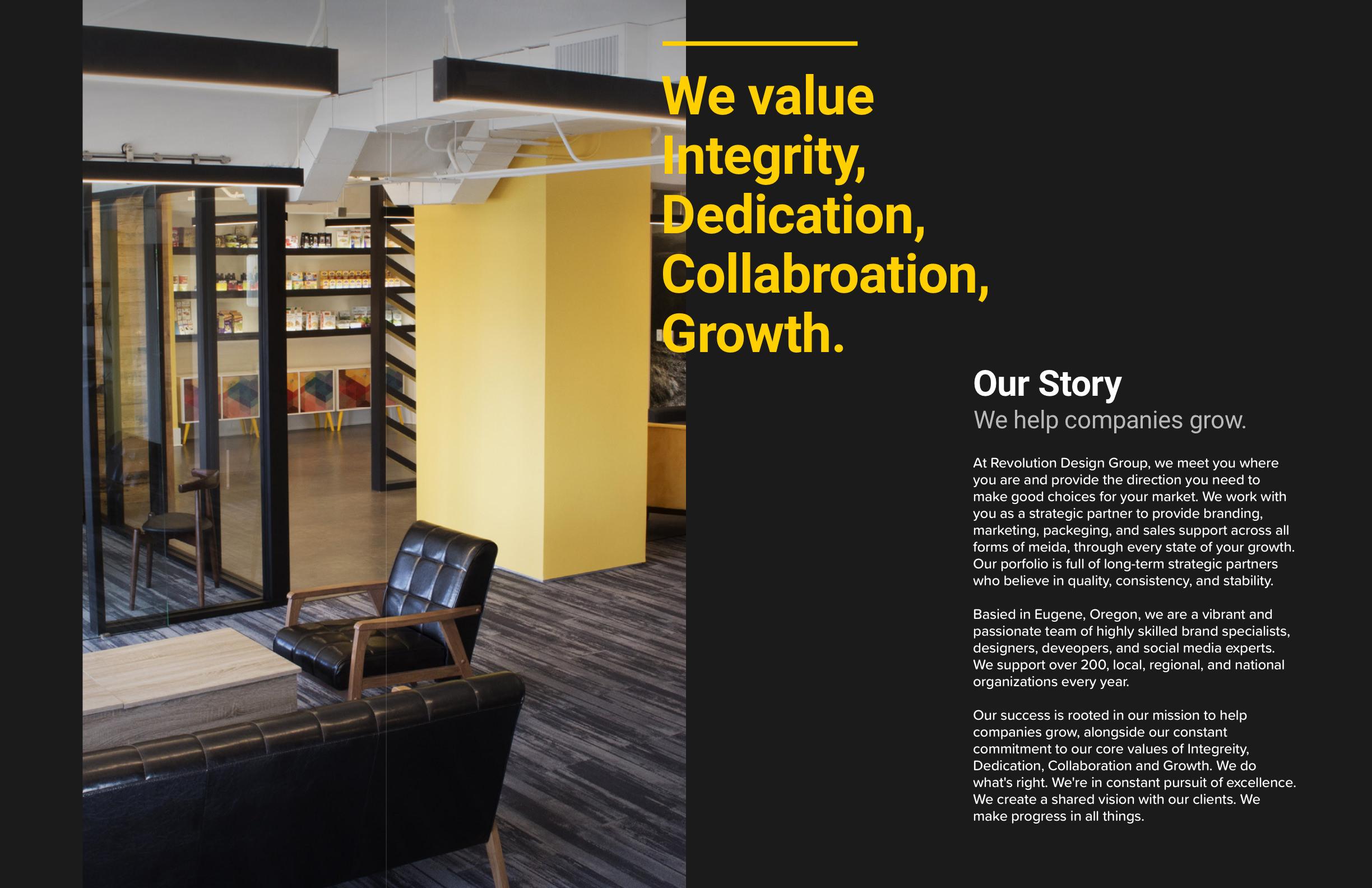
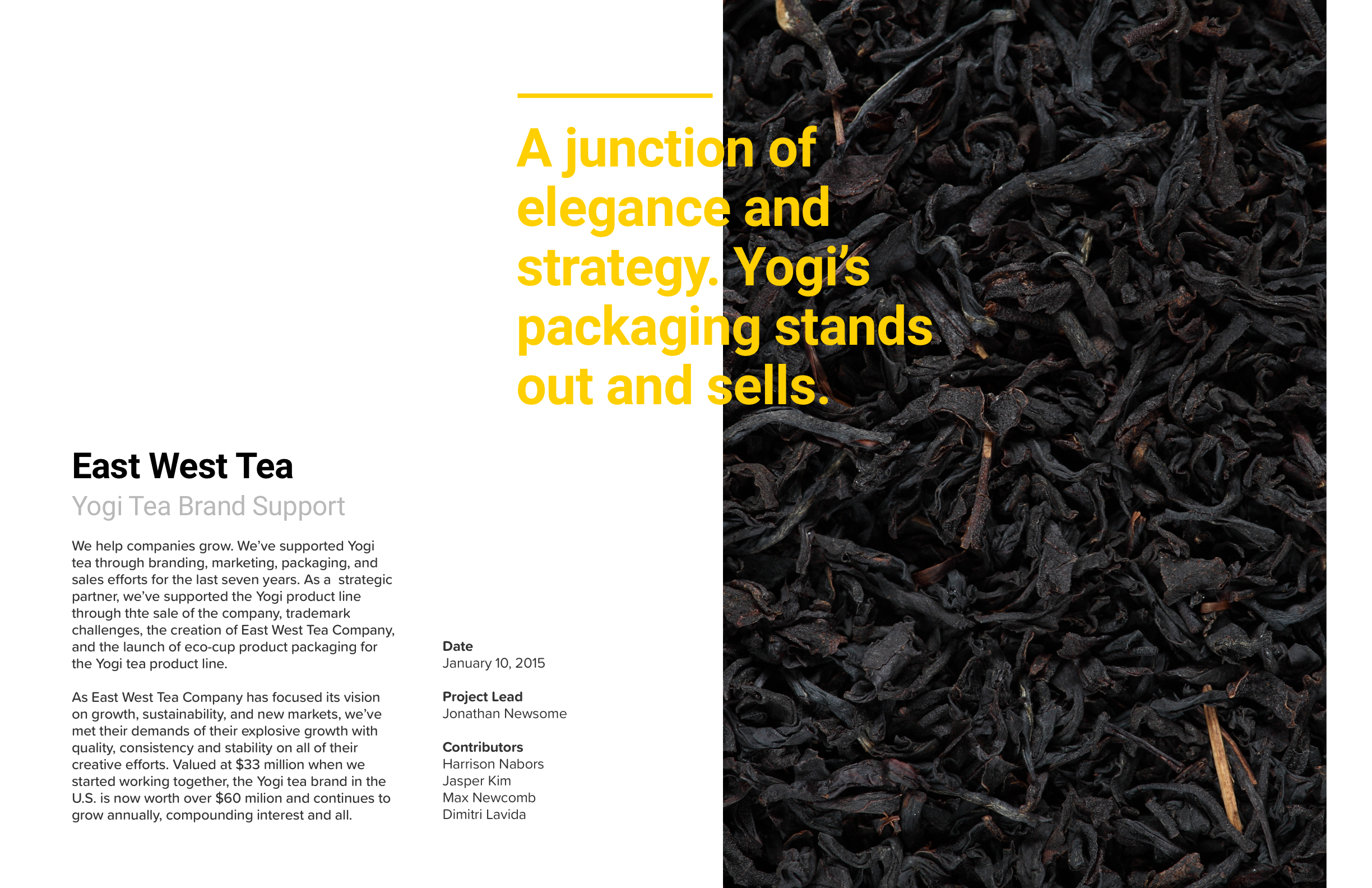
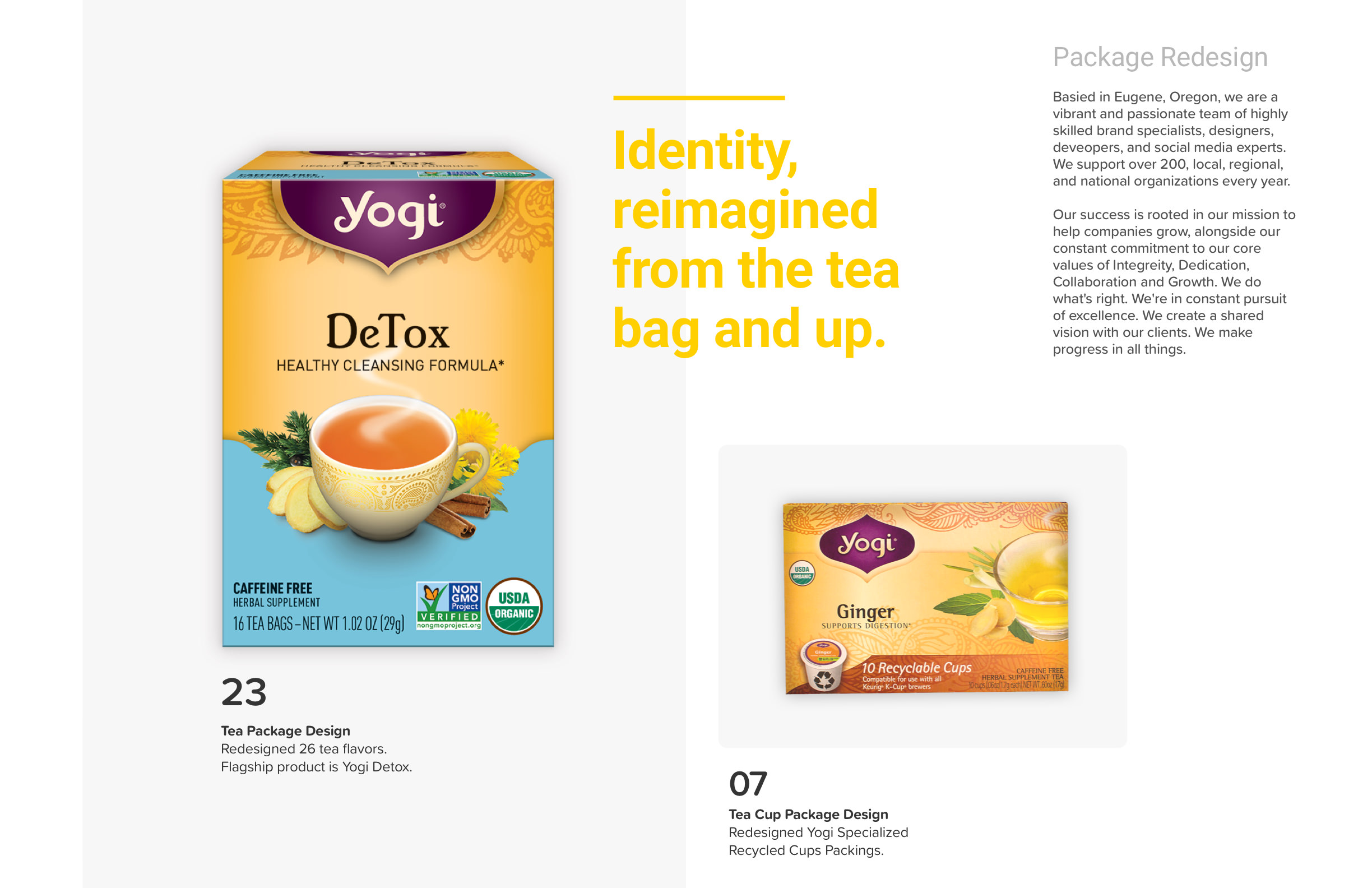
Here, the idea of contrast became the theme of the project. Yellow, black, and dark grey became the primary colors of the canvas. Their contrast emphasizes the opposite: white emphasizes the darkness of grey. Grey uncloaks the radiance of yellow. Large quotes from members of the project contrast with the smaller-sized project description in their tone and design.
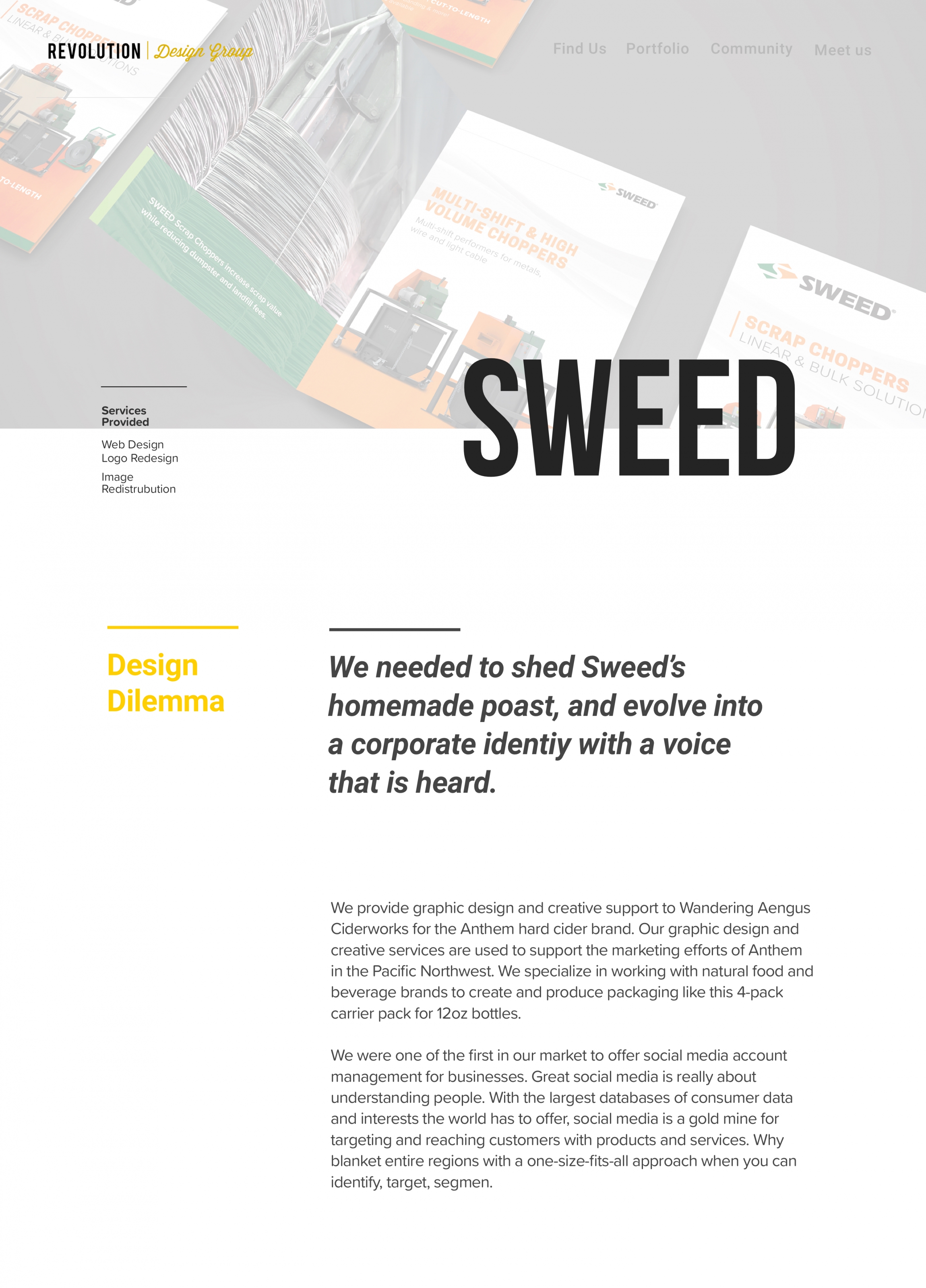
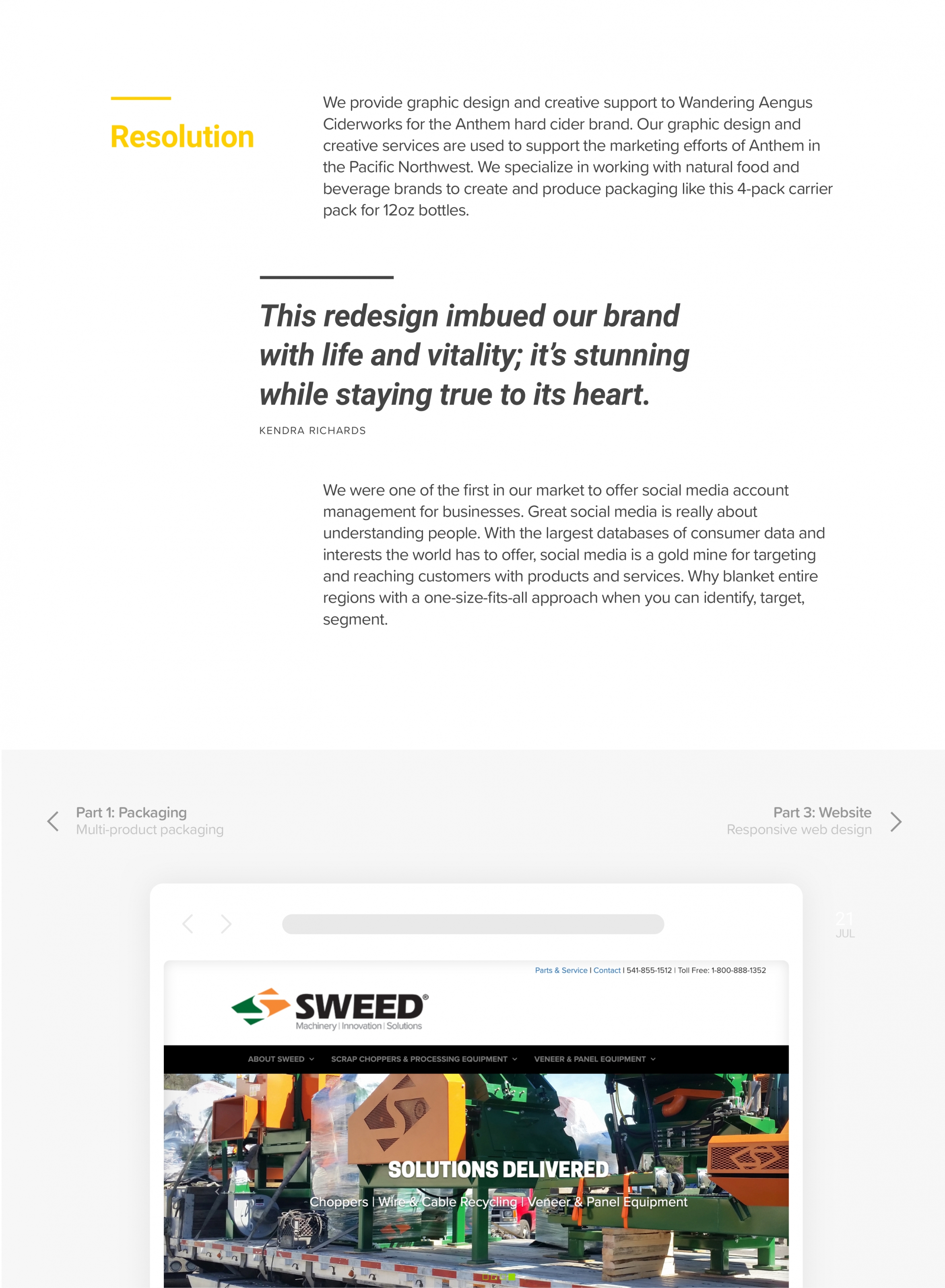
Each page tells the story of the progression of the project, consisting of three parts: Dilemma, Drawing Board, and Resolution. This before and after is another element of contrast that strengthens the RDG’s role in the project, while also allowing personal insight into the process.
- Dilemma: the problems the client faced before RDG executed their solution.
- Drawing Board: general musings, project concepts, and design process.
- Reflection: the client’s recognition of RDG’s solution and the presentation of the final result.